

'Pie chart' becomes 'camembert' chart in French class
Published on
Translation by:
 ZoeBBee
The current economic climate is enough to give you indigestion, but I rue our European economics experts having the idea of using charts resembling food. It gives students like myself grumbling tummies everytime we attend economics class
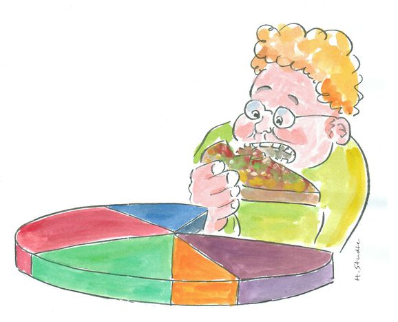
The culinary delicacies of the European continent also have a place in its economy. Lecturers of different nationalities use diagrams based on their homeland’s delicacies and specialities to help students to follow otherwise rather dry and difficult economic theories shortly before the lunch break. In Great Britain, it’s the pie chart that makes students’ mouths water. In Poland,Germany, Spain or Italy, the tort, grafico atorta,tarta or Tortendiagramm ('pie or cake diagram') has students dreaming of a dash to the nearest bakery. My professor in Paris likes to call our charts a nice, round camembert or even pizza. In the end, the different names for the diagrams – whether they're known as pies, cakes or camemberts – probably result from the way that potential shares of the diagrams appear as individual 'slices'. In today’s lecture theatres, all these different expressions will be added to the ‘cooking pot’ and given a good stir: when it comes down to it, everyone wants a piece of the European pie.
Illustration: © Henning Studte
Translated from Magenknurren im Hörsaal